Before
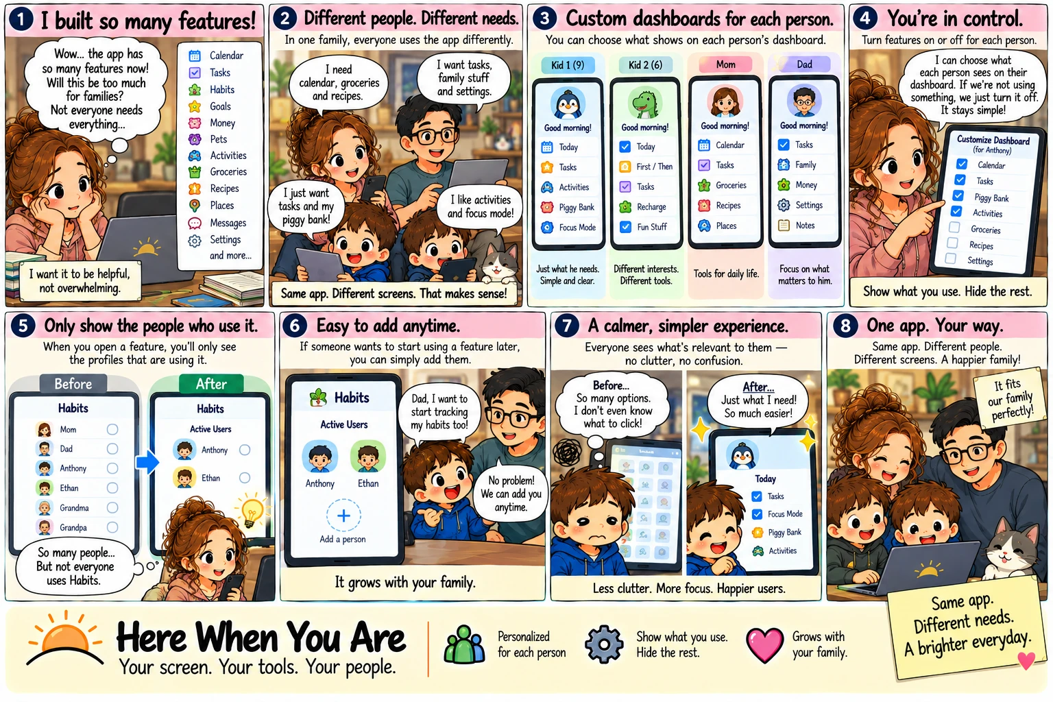
So many features — and everyone sees all of them.
1“Wow… the app has so many features now!”
Calendar, tasks, habits, money, pets, activities, groceries, recipes, places… “Not everyone needs everything. I want it to be helpful, not overwhelming.”
2Different people. Different needs.
“I need calendar, groceries and recipes.” “I just want tasks and my piggy bank!” “I like activities and Focus Mode!” Same app, four different days.
3“So many people… but not everyone uses Habits.”
Every page lists the whole family — grandparents included — whether they use it or not.
4“So many options. I don't even know what to click!”
A screen full of everything is a screen a child can't find their way around.
After
Same app. Different screens. That makes sense.
1Each person's own screen.
Kid 1 gets just what he needs, simple and clear. Kid 2 gets his interests. The grown-ups get the tools for daily life.
2You're in control.
“I can choose what each person sees. If we're not using something, we just turn it off. It stays simple!”
3Only the people who use it.
Open Habits and you see the two boys who use it — not six names, four of them empty.
4Easy to add any time.
“Dad, I want to start tracking my habits too!” “No problem — we can add you any time.” It grows with your family.
5Less clutter. More focus.
“Just what I need! So much easier.” Same app, different people, different screens — a happier family.
Nothing is ever deleted.
In Here When You Are each person has a list of the pages they use. Untick one and their name leaves that page, and a child's phone stops showing it. A grown-up's own menu keeps everything, so the parents can still go anywhere to help. Tick it again the day someone wants to start.
you use.
Hide the rest.